interior photography

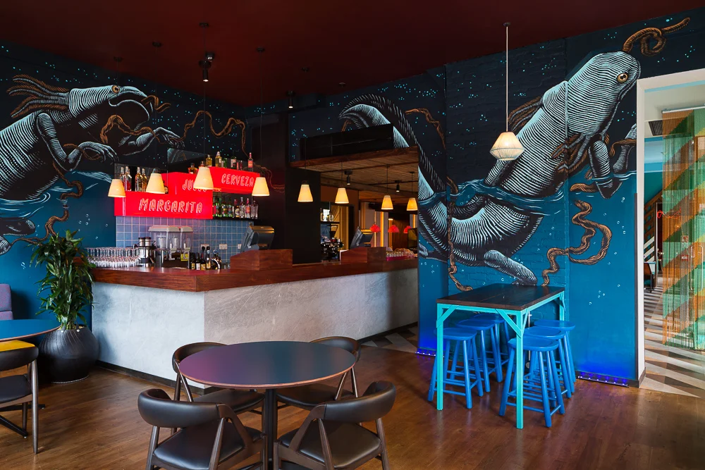
Wahaca Brighton restaurant photography for Softroom

It was great to shoot another Wahaca restaurant, this time in Brighton. It's a fantastic space with distinct zones marked out by the structure and the interior design, and stunning murals by Mexican street artist Mazatl. There's a private dining area screened from the street by a multi-coloured chain-link Virgin Mary. The architect/interior designer is Softroom with lighting design by Kate and Sam

Wahaca have been certified carbon neutral and given a top rating for sustainability - it's great to know that both the food and the restaurant design have minimised their impact on the planet, even while they have maximum effect on your tastebuds and retinas...

Bonhams Knightsbridge for Kate and Sam Lighting Design

I recently shot Bonhams auction house in Knightsbridge for Kate and Sam Lighting Design. One great thing about winter is that dusk shots can be done at a sociable time of day!

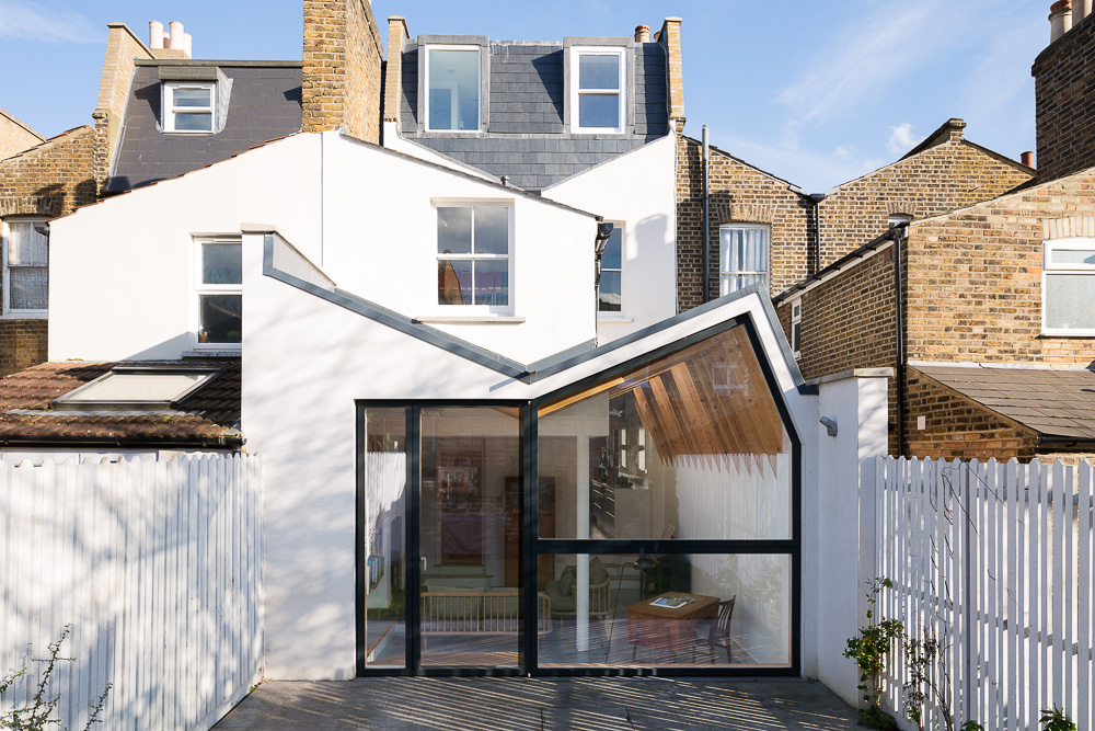
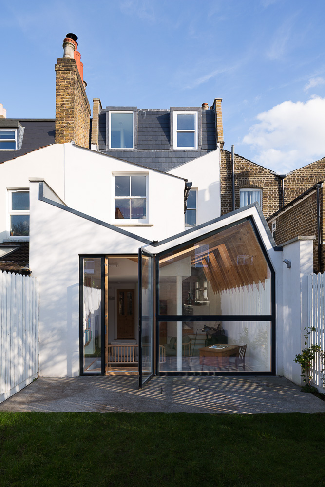
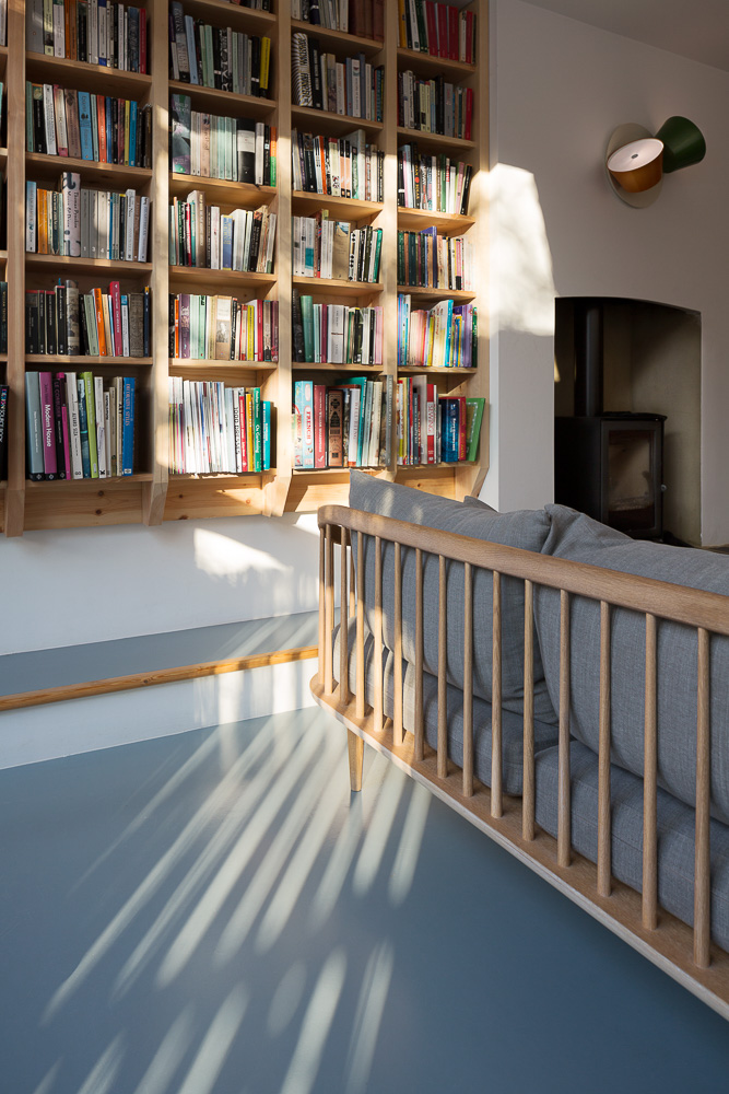
Harcombe Road by Forrester Architects featured on Dezeen

A really interesting extension/renovation project I shot for Forrester Architects is featured on Dezeen: http://www.dezeen.com/2016/03/01/kenny-forrester-architects-harcombe-road-house-extension-north-london/

Neckinger Mills for Mark Fairhurst Architects

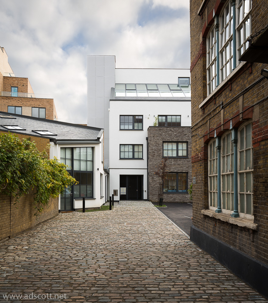
A recent shoot of a mixed-use office and residential project for Mark Fairhurst Architects (www.mark-fairhurst.co.uk). The building is located next to the busy train tracks into London Bridge station. We found a good vantage point on an adjacent block, to put the building in context as dusk fell. And we took a few interior shots in a magnificent apartment - the perfect flat for a railway enthusiast.

Using flash in interior photography

I recently spent a day photographing a beautifully refurbished Victorian house in south London for Hughes Developments (full gallery on their site here).

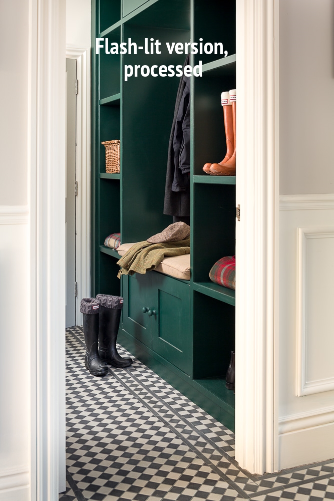
The owners had created a country home feel in a house that is just 5 miles from the centre of London. Maybe because they're just a few miles from some of London's biggest and best outdoor spaces - Richmond Park and Wimbledon Common - they'd asked Hughes to create a boot room for them. It was a tight space to photograph, and though I'd shot the rest of the house using almost exclusively natural light, with a bit of feature lighting thrown in here and there, this required a bit of extra light to make it work. 

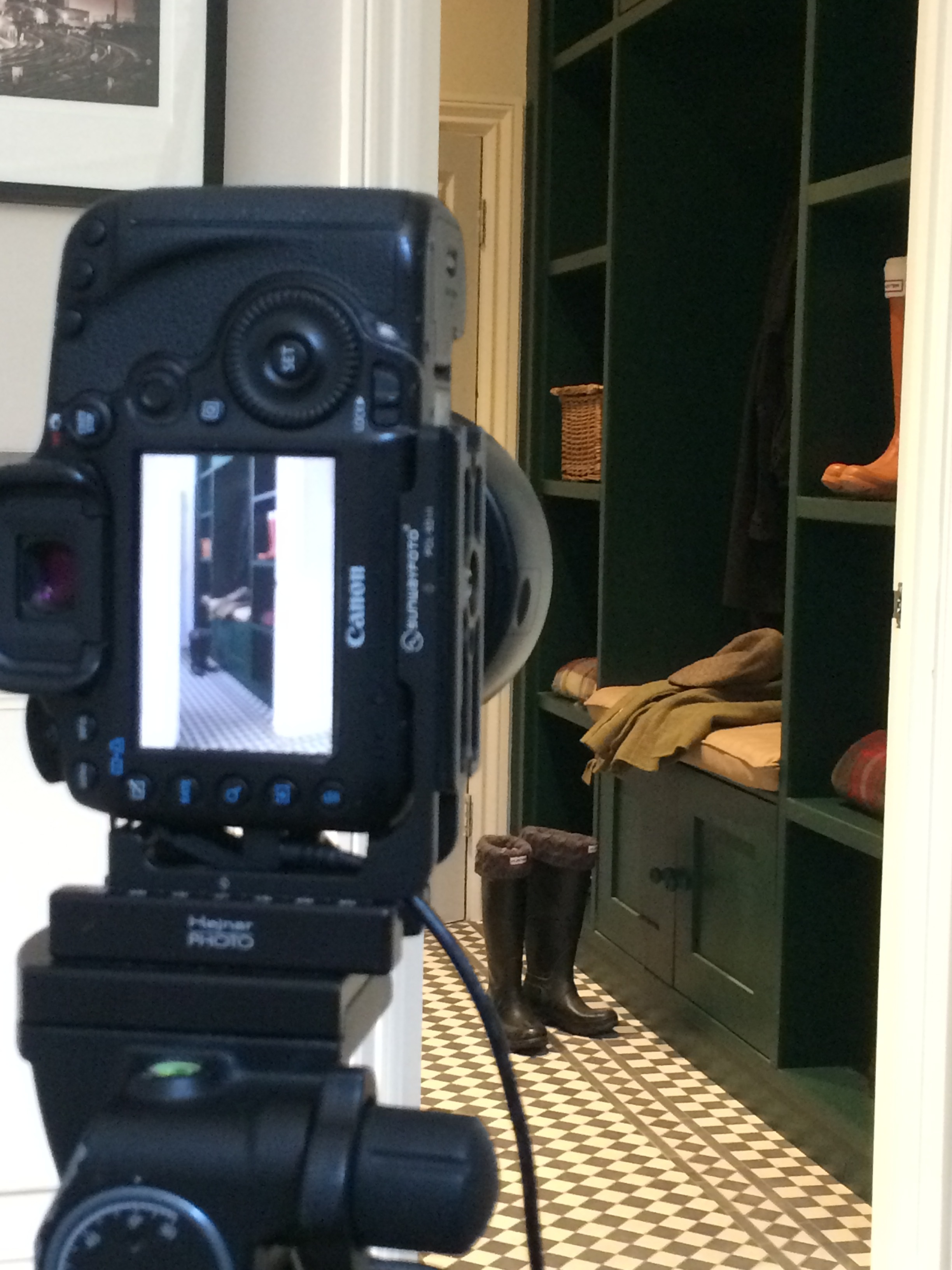
Shooting through the doorway into the boot room was just about the only way to go, as it was a very narrow space. Little natural light was getting into the boot room, and not from a flattering direction. The room lights would probably have worked, with a bit of tweaking in post, but flash allowed me to create more interesting light that modelled the joinery, wellies and coats more attractively.

Shooting through the door also offered the advantage of allowing me to hide the Speedlite in the side of the room the camera couldn't see. I used Pocket Wizards to trigger the flash. The lens is a Canon TS-E 45mm f/2.8.

Here's the various lighting scenarios and the final, processed image:

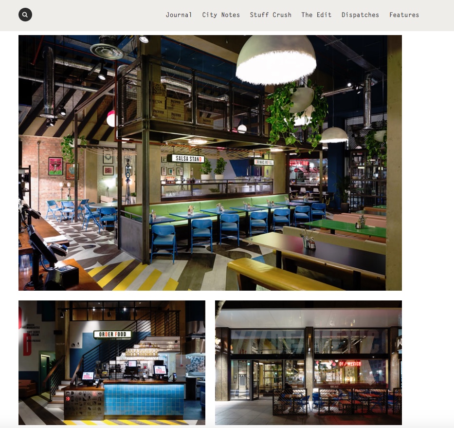
DF/Mexico, Tottenham Court Road by Softroom

A couple of weeks I ago I shot the second DF/Mexico restaurant to open in London, on Tottenham Court Road. The architects/interior designers are Softroom, the lighting design is by Kate&Sam. The photos were also commissioned by the restaurant for their own promotion and have been used by several blogs and reviewers.

More pics on my site here. We were too busy shooting to sample the food, so I really must go back for some tacos, they certainly smelled good...

Turning out the lights

It was a real pleasure to shoot this South London loft apartment for Poulsom Middlehurst a few weeks ago. Or more precisely, one half of a one-room loft apartment, as the client was in the process of moving back in and we had to push his bags and boxes to one side of the space and focus on the other!

The big roof lights let in a huge amount of natural light. Luckily it was an overcast day so we didn't have big contrast ratios and shifting shafts of sunlight to contend with. We opted for a clean, unoccupied look and the white walls and bare wood floor looked great bathed in that soft light.

We didn't need any additional lighting so we could use our time to concentrate on the shapes and structures of their ingenious design. Sometimes it's great to turn the lights out and keep things simple...